Reviews of Design Groups
Home
I Love Dust...
"I Love Dust" was started back in 2003 by Mark Graham and Ben Beach. They were both working for a fashion label and decided their time would be better spent on their own ventures.
This studio set up shop in Southsea, UK and went to work building a portfolio of initially local clients, but were soon working for some of the biggest companies in the world like coke, Bloomingdales and T-mobile. They create outcomes from various backgrounds such as graphic design, illustration, animation and trend prediction.
They collaborate both in-house and with global brands, working together to create fresh, innovative designs, which makes up an award-winning portfolio; also mixing in some of the best British designers along with talent from around the globe.
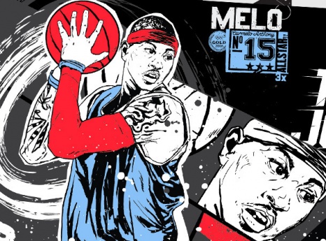
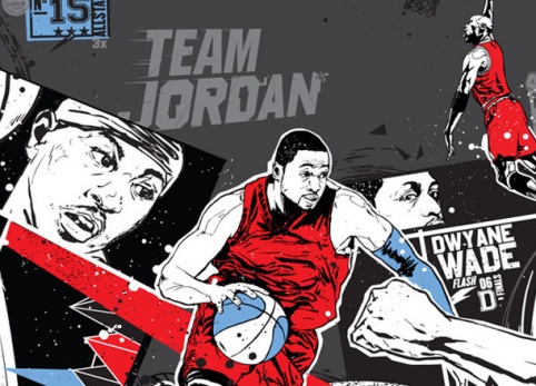
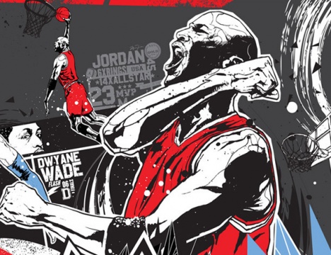
Jordan Mural
This is a great mural compiled by London’s “I Love Dust” after teaming up with Anomaly. It features Carmelo, Chris Paul, Dwayne Wade, and of course iconic moments from Michael Jordan’s explosive career on the court. Illustrations of the players in black and white but with hints of colour to various parts of the image overall- symbolising important features- such as the vest tops, the basketball itself almost defines the sport. Therefore attracts the viewers. Interestingly representing a narrative of a game-taking place, relating this to comic books except the speech bubbles.


.Net
Editorial
This editorial piece was based around the clients and designer relationships for a .Net Magazine article. Very simply done but at the same time showing all different factors people involved in design do- whether as a group or an individual. With the brief cases, ipads, dummy mannequin, all areas of design is displayed. Without any text the viewer is left with information and with something that they can have on show anywhere really. I like how the 2nd design is almost like a timeline starting from logo and then onwards to meeting, shaking hands and so on- like a step-by-step guide as to how design industry works.
I like the colours used in the first image as it stands out more compared to the second. The navy and turquoise blue allow the icons to appear bold from a distance. The second design is more elegant and subtle coloured.
Nike Football
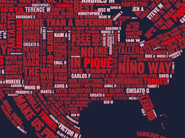
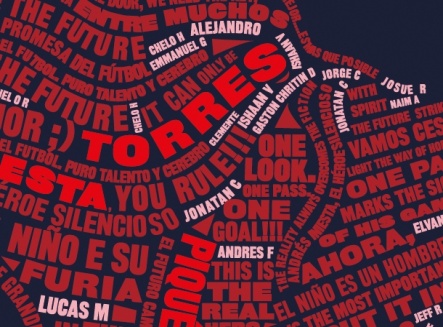
The Future is Written
When it comes to typography I really love it when personal opinion or such as “quote” are presented in a way that strikes at the viewer to observe and take time to understand what it is the picture/text is telling you. This piece was interesting as it involved the thousands of fan-based quotes on the Spanish and Dutch teams when they played in the world cup final. Asked by Wieden+Kennedy the ‘I love Dust’ team produced 2 globes featuring people’s words from Nikes and Facebook. In different languages, various sized typefaces and 3 shades of colouring really help bring out the shape of globe. The more vibrant red outlining some of the player’s names e.g. ‘Torres’ catches attention especially if you’re unaware of the topic you see a famous players name and would want to look closer as to what it might be about. Its beautiful how a lot of people in different areas have something to do with this outcome- as the quotes are on show.

Circus Alphabet
A-Z
This is one my favorites I haven’t ever seen anything else like this based around a circus show. I’ve only come across alphabets that have been created using hands in many angles and shapes to form a letter. But not something as creative like this. Individually or as a small group each illustrated person is performing a movement that’s presented at a circus, not just at random but actual performances that you will hope to have seen. The alphabet as a whole it not only appealing and completely something different to look at- but educational as it can help children to observe and relate it to the theme in general which is ‘circus’. Also adding in the materials the circus member’s use such as the hula-hoop, air balls etc. give a fun and cool feel to outcome.
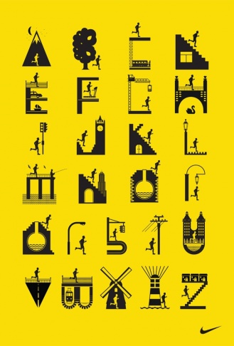
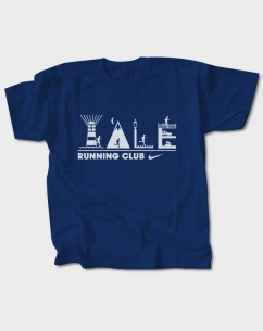
Nike Running Club
Alphabet
They worked with Nike during the designing of this alphabet design. Comparing this alphabet to the 1st design (circus) it is brighter, it is quite hard to see the letters as they are shaped uniquely trying to stick to places one runs in. The little person in each letter as the main objective as to where he or she is placed in order to make the lettering become more clearer. Again going back to the .net editorial magazine piece- it’s like a step-by-step layout of the person in different places (letter) running.
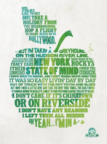
VH1
VH1 Letterpress Lyrics
American Classics get a letterpress treatment for Vh1
Series of letterpress posters produced for VH1.
Each poster features lyrics from a different artist and each is printed in a different colour. I’m generally inspired by the way the type in different styles and sizes can produce an image overall. Linking this to their previous work I discussed about which was the Nike football world cup globe. With the light and dark shades of green symbolising the apple itself from a distance.
Matt Howarth...
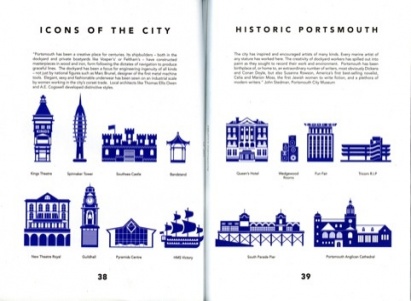
I came across this beautifully designed book ‘Creative Portsmouth’, which has been designed by designer/illustrator Matt Howarth a member of the I Love Dust team, that features interviews with existing and up-and-coming creative- including Dave Thompson, Climax Studios and jewellery designer Barbara Tipple. Many people including me think Portsmouth is a place that seems to attract creative people who fall in love with the city and simply never leave, building lives, homes, careers and setting up in business.
‘Their genuine love of the place is evident because so many of them incorporate it into their work. From photographers and graphic designers to street artists - there’s something about this city which seems to inspire people to make it a part of their art.’
Contributors to the book have been encouraged to suggest their favourite spots in the city and produce creative inspired by it locations. Highlights of the book are motifs created by Matt Howarth, which show iconic buildings from the city. These also adorn a poster, created to accompany the book (in red). A poster that has little text yet defines the identity of the posters meaning with iconic images really does inspire me. It helps to observe it clearer as the colours used are flat and haven’t been printed in different shades compared to the previous work discussed.
Matt Howarth has been working in design studios and freelancing since 2004, and currently holds a Senior Design position within ilovedust's Southsea studio. Matt has done book covers, interior illustrations, album covers, commercial art, advertising art and layout, cartooning, comic strips, and commissioned work. He has produced some stunning work for the likes of Nike, Gap, Lucozade, GQ and KidRobot. Mentioned before he created Creative Portsmouth booklet and poster- but his previous works for clients has inspired me a lot.
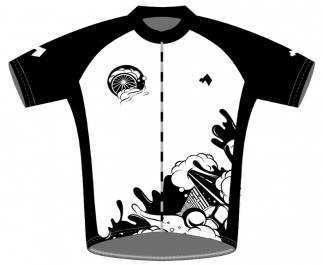
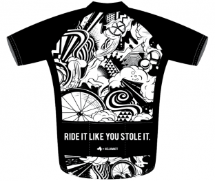
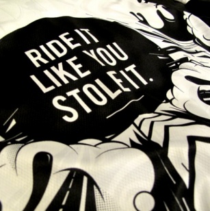
Back in 2010 Matt Howarth created one of the first ‘Milltag’ jerseys and it sold out very quickly. Now in 2012 Matt has remixed the design. He originally explained: “I wanted to create an illustration which incorporated the speed and excitement from riding your bicycle at pace. The freedom which your bike gives you and the rush of burning down a hill is unrivaled. And of course I wanted to create something which you would not find on a regular jersey.”
The new design features a brand new version of the illustration, a water-marked graphic throughout the white panels and new back panel. Unlike any jerseys I have seen this one stood out the most for me. I love the deep and bold outline of the clouds, the wheel and the road leading the pathway. Altogether forms something that’s active yet intriguing to look at.
Vault49...
Another design group internationally successful worldwide designing in various areas including: illustration, photography, and motion graphics…
I mentioned some of the work this group created during the discussion of the first group task that was undertaken- ‘motion graphics’.
The reasons I’m coming back to them is because I appealed to their illustrative work. Combining real life images and vibrant colourful shapes/outlines.
Reviews of Individual Designers
Louisa Bertman
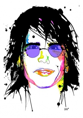
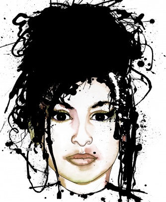
Louisa Bertman’s focuses mainly on portraits and illustration. I find her work fascinating as she uses different mediums such as pens, inks, watercolors and fountain pens in order to get the splat effects onto her portraits. She has worked for many clients in the past and still in the present. If she’s asked to create a portraiture that needs to go onto some sort of spread- newspapers/magazines, she scans in the piece onto computer and adds a little tweaking to it. The huge canvases she starts them off as small and they gradually get bigger as she goes back to them and paints over them- adding in ink splats etc. Not only are her portraits intriguing to observe but what she tries to aim for during the process of creating them… she tries to capture a spirit behind the portrait, if its about a celebrity she’d capture something about them; if it’s an article that she is designing for then she’ll have to explore what the article is trying to say even though it’s an illustration but the editorial of typically what the article is on it’s a cover of the essence of the person.
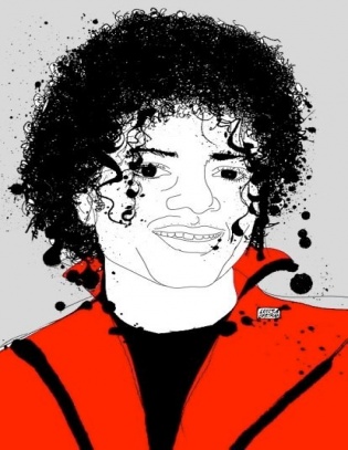
Clients: Mikhail Gorbachev (front page top fold Wall Street Journal) to hotel maid service (Penthouse Magazine), to dorm room door doodles (TV’s The Gilmore Girls), her illustrations appear in diverse media worldwide. She painted The Car Talk Guys for NPR, Michelle Obama for BUST Magazine, Michael Jackson for Dallas Morning News, and Ringo Starr for Live Nation. She illustrated DJ’s for The Village Voice, and composers for GQ Magazine. She’s created animations for AT&T, Nynex and IBM. Her advertising work includes Walz Tetrick’s Kansas Teen Thinking Campaign, Wells Fargo’s African American Entrepreneur Calendar, and The LA Gay and Lesbian Positive Images Campaign. Several of her oversized Rock and Art portraits have been signed by high rollers such as Fergie, Ringo Starr, Cyndi Lauper, Chris Isaak, Ziggy Marley, Huey Lewis, Chicago, Keane, Anna Nalick, and Hilary Duff.
Illustration, Graphics & Information
Illustration, Graphics & Information
Celia Johnson
Focusing on graphics, illustration and new media designing- her prints are very simple and clearly bold to look at. The layout of the imagery is very spacious as the colours allow the actual filled in imagery to come alive more within the vibrant reds. Flat choices of colours for the background is something i prefer than gradient colours of different shades. Simple is more- therefore too much effect to a poster- there will be alot of activity going on.
Slightly different colour background, but yet again the same perspective is received as the 1st poster. The red stand out from the lime green; but a much bigger size of the side face- from far the main focus will be toward the bold red.