Pentagram Visit
Home
Harry Pearce Talk
We went on a visit to Pentagram ‘the world's largest independent design consultancy. The firm is owned and run by 19 partners, a group of friends who are all leaders in their individual creative fields’. They work in London, New York, San Francisco, Berlin and Austin. They design everything: architecture, interiors, products, identities, publications, posters, books, exhibitions, websites, and digital installations. We were expecting a talk by Harry Pearce himself a member of the team. During this talk I took notes as to what I found interesting about Pearce and how he came across with ideas that have lead to success. He discusses about how his former sponsor Alan Fletcher, when he was alive how he used to collect bit of rubbish from anywhere- a bin on the floor etc. and turn it into something beautiful. Giving out advice how you should capture anything you sees that strikes you; never stop collecting what you see in the moment. This was one of the things I used do during my time in sixth form for art and design. Documenting whatever it is- that you might use in the future.
During Pearce’s earlier days he used to make pictures out of words, e.g. bed= the word b-e-d becomes an image. Playing around with simple words was something he’d go onto to explore.
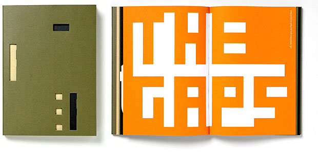
When he joined Pentagram one of the 1st works he produced was a book, which the cover slides and you get the word ‘Decipher’ (below). Inside are collections of hidden meanings of typography. This really allows the reader to go into depth as to what it is they’re observing; creating some form of interactivity here- which is very interesting.

When he worked for a charity event for a festival called PEN- an international campaign that ‘run programs globally and events celebrating the bond between literature and freedom of expression, believing that one cannot exist meaningfully without the other’; he had to come up with an ‘identity’ bases around PEN. Something that’ll present a connection of a ‘narrative’- it will have a meaning behind it. As the main focused point about them is ‘bringing languages and cultures together’. There are 144 Pen centres globally in different areas, gathering people from each centre to take part in the identity by asking them to write letter from the alphabet in their language and in their own handwriting. He’d combine all the different types together to form a final piece- leading this to something of a diversity of a symbol… as the letters in the people’s styles and languages shows culture and beauty.
Free The Word...
Exploring the shapes of circles & type- filling it in, at first it didn’t turn out to look too appealing (above). The types seemed messy but then John Simmons, put this idea forward of re-organising the symbols- arranging the bold and dark tones of lettering together when the lightly toned letters were put separately together. In this case the after effect a world was created, and that became PEN.
Haiti Poster Project...
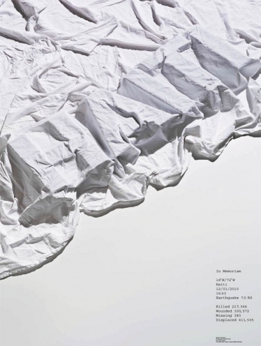
Pearce has also contributed a design to the ‘Haiti Poster Project’, the fundraiser that launched three days after the earthquake struck the country. A huge range of designers and artists have submitted signed and numbered limited edition posters to the project, all of which are for sale on the organisation's website, with all money raised going to ‘Doctors Without Borders/Médecins Sans Frontières’. The Haiti Poster Project has been organised by Leif Steiner, creative director of design and advertising agency Moxie Sozo (who helped start the Hurricane Poster Project to raise money for the victims of Hurricane Katrina in New Orleans). Pearce has tried to seize something emotional for a very long time- watching a film for example that storyline has an effect on you. In graphic design its difficult to approach this matter, therefore the poster above was the closest he could get for the Haiti project. So simple yet getting the message across with the white sheet- creating the 3D letters to Haiti, the white sheet and pale greyish background colour symbolises the thought of hospitals, and medical centres- due to the donation going to ‘Doctors Without Borders/Médecins…’
Memories, Dream and Reflection
One of the interesting stories Pearce told us that was quite personal, which I found quite fascinating was about his dreams. At the age of 17 he picked up this book by C.G.Jung called ‘Memories, dream and Reflection’, and ever since he’d read it once in a while. He went on talking about how he would record his dreams in journals- sketching out what he saw/ writing down what he heard… this one time he was away in Switzerland exploring the areas, discovering new ideas when couple of days before he had a dream about a lake and a whale. During a road trip in Switzerland he came across the same lake he had seen in his dreams, and it was named after whales. In many cases could be a coincidence or he believed was something amazingly magical. He talks about how you should keep a note for things- keeps your eyes open, again linking back to what Fletcher suggested, ‘always document what you see in the moment…’ you never know what might just happen if you carried that piece or pieces memory with you.
Explore Pentagram
Westminster Illustration Degree Show 2012...
On Monday 11th I attended the “illustration & visual communication show 2012”. All the final years students who carried out the course of illustration- their work portfolios were displayed on the tables upstairs; which was the first thing you see when you enter.
ANA-MARIA MARINOU
She was a student who studied illustration and graduated at university of Westminister, her work in particular really interests me as she uses software’s such as photoshop to create these imaginative storylines of characters, which are very colorful yet subtle pieces of art. (http://www.annamariaillustrated.blogspot.co.uk/)
YVONNE MICHAELIDES
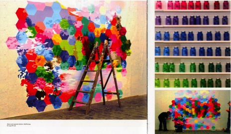
I like how she created paper-based outcomes for Fedrigoni's YCN brief that almost look like solid spiked balls from far, made from a completely different material e.g. plastic or coloured metal. Linking in with the cold, warm and neutral colors- as though the viewers can interact with them, bearing in mind they’ll be thinking about all sorts of what the colours show. Her work is beautiful and unique compared to the other 3d outcomes that I saw during this exploration. I personally preferred the warm colours- the orange’s and reds really stood out from a distance; some parts of the cold colours (blues, greys) did quite catch my attention but that was about it.
(http://www.yvonne-nonimi.blogspot.co.uk/)
The video is a clip of the spiked balls unfolding and folding to form the shapes (below right).
I loved her illustration skills, as she would try to gain more different techniques to create such fine outcomes. I was really interested in her work so I did extra research as to how the process goes for her and how she gets inspired to aim for detailed displays.
She’d research into other illustrative artists works, and pick up on what makes her drawn to their outcomes. For example this one artist I found quite interesting that she mentions was 'Siri Weber Feeney', this artist combines cultures to her work, I find that quite important in work- as it represents some sort of narrative.
ORINTHIA TYRELL
'Cecilia Carlstedt' was another artist that I was interested that she talks about. I remember coming across her work during my time in sixth form, reading that after graduating 2003 she begun her career as an illustrator and have since then been commissioned for a wide range of clients such as H&M, La Perla, Swarovski, Paul Smith, Victoria Secret, Martini Gold, Elle, Vogue, New York Times and W magazine.
I really liked Cecilia Carlstedt ink based work, how the colours flow across the page. I can see how Orinthia found her work appealing- as both their work do have some form of free use of colours blending in. She mentions how her works seem to look free, and it does… they also look detailed but very simply done at the same time, most of them look unfinished but I guess that the effect was supposed to be.
With Orinthia’s illustrations some of the sketches she started from scratch onto photoshop cs4, but most of them she’d hand draw them and then scan them onto the software and draw on top, using various tools.
(http://ultraviolet707.blogspot.co.uk/)
Rikki Hewitt
From the upstairs view this was a very huge display that took up nearly a whole wall size. This piece of work was based around the isolation and outcasts. I liked his work because it goes back to history- during the war times and also the use of the black and white blending in some colour too- really brings the image as whole more boldly.
Most of his work seems to be cut out and pasted on top of each other- forming a collage.
(http://cargocollective.com/rikkihewitt).
‘Images designed to accompany a PDF presentation about creating an installation in Spitalfields Market involving 70's and 80's children's toys’.
The paint smudges across the images really adds on a rough effect, as to how some parts are hand done. The blue/ grayish colour paint look like the riverside opposite the big buildings.
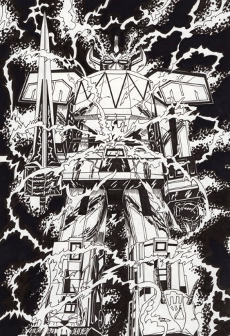
ALEXANDER HUNT
Another illustrators work that I was fascinated by. Using fineliners the detail of the transformers character, almost looks really professionally done on computer, when it was drawn and then scanned in. He’s really passionate about comics and any sort of narrative art- therefore creating his own storyline of ‘Megatron’ and ‘Optimus Prime’ characters, really explores the depth of his imagination as to how he collaborates to achieve something new and unique. Also the fact that he doesn’t add colour to his comic designs relates back to the old classic comic books when they were similarly done. (http://www.alexander-hunt.co.uk/index.php?/aboutcontact/)


I really likes his ideas that he created for a competition that he entered for the ‘Italian Fedrigoni’ paper company to promote their products by trying to design and build a piece of furniture out of paper. Each piece is hand painted with watercolour, and decorated with pen, colouring pencil and collage. Each piece of furniture symbolised the qualities of the paper, practical, stylish, tough, soft.
These designs seem more lively as the colours are bold and more vibrant. The furniture (chair)- has an antique feel to it when you look at it. The patterns really give an embroidered appeal even though it’s been hand drawn.
Francesca Smyth
Francesca’s typefaces are unique in ways as to how she cut out the words so neatly, in different styles from bold to curvy italics. She’s interested in print making- which sort of links to these designs as how they look like stencils…
This is one of the typefaces designs I liked by her- inspiration taken from photographs she took of pavements and brick walls… you can make out the shapes of the bricks in each letter.
Some of the research she has done quite inspired me, mainly because she describes the work done by others as beautiful, and dimensional… these images were taken from a book (wall paper). Linking in with her website design that she was designing at the time. She didn’t mention it was anything to do with her website, but I think there is a link with the two. (Sofie Lagerkvist, Charlotte von der Lancken, Anna Lindgren and Katya Savstrom - design group "Front").
"Walltherapy", paint by numbers wallpaper. A collaboration between Rachel Wingfield and Flour aiming to combine design with neuroscience and colour science. It allows the creator to create an environment that is individual and personal to them, based on their colour preferences, which could possibly "enhance people's sense of well-being."
Francesca talks about how she loves science that combines decorations in the wallpaper; there fore going back to her “cut-out” quotes above her work do have some sort of science point behind together with typography. It’s interesting how she did similar to these artists that she researched.
I find the work produced by her and the artists seem quite floral. Very flowy and mainly based around shapes… I think its important when creating any typeface, tha the body of lettering is clear but yet unique at the same time- and that’s why I find her “brick” typeface and cut out lettering really interesting to look at, also the way she has done them; with different methods.
(http://www.francescasmyth.blogspot.co.uk/)
Charlie Rallings
This caught my eye as I went downstairs and found it on display. From far I could I thought they were wolves at first- but it’s actually stated she was developing the ‘theme of dog fighting’. Using charcoal and boot polish- she aimed to get the smudged effect of the dogs blending in with bodies.
(http://www.charliessketchpad.blogspot.co.uk/)
She also creates fashion illustrations, which I found was quite different compared to her displayed work. This is her ‘weekly diary’ of sketches that does perhaps in her spare time… I’m not too sure as to what materials she uses in order to achieve these detailed drawings- but I’m assuming fineliners, coloring pencils and maybe water colours to get the blended look.
JAY JAEMIN LIM
(Graphic Information Design)
MALDIVES UNDER THREAT
“An installation piece that explains the threat to the Maldives. Due to global warming, and the melting of the ice caps at the South Pole, the low lying islands of the Maldives are being submerged by rising sea levels”.
“Showing increasing in number of natural disaster in 2010 compare to 2004 & 2005/Typography
Chile Earthquake & Tsunami
Haiti Earthquake
Pakistan Flood
China Earthquake
Indonesia Volcano
Scale A2
(http://www.wix.com/dlawoals20/jaemin-lim#!)
I remember seeing this student in the studio when he was cutting out the small letters. I think he was painting them in black or maybe he was using some other form of materials at the time. I was wondering what it was he was making- but when I attended this show I was interested to see his final outcome. I really liked the idea of how the words are ‘sinking’ into the base- representing the areas of the flooding.
I found this piece of work done by Jay Jaemin Lim interesting- mainly because of the shape and sound waves- colour coordinated. It’s stated that he was trying to show the reaction of 3 people toward 3 music’s. I’m assuming perhaps in genres (jazz, rock, hip hop etc.) it’s very simply presented, perhaps designed onto illustrator or in-design.
Saatchi Gallery...
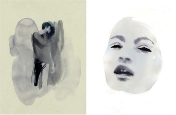
Mat Collishaw
After the degree show I went to visit the saatchi gallery, there wasn't much to look at that inspired me- except 2 artists pieces...this piece by Mat Collishaw: 'Madonna'. "Madonna’s timeless face is cropped from a photograph of an Indian woman taken after her village was destroyed in a flood. These tragic images seem all too contemporary with their digitised high-gloss finish. However, their surfaces aren’t photographs at all, rather they’re made up of tiny, cold ceramic tiles". The reasons why I found this work interesting is because from a far distance, it gave the effect of it being pixilated- looked digital. But also because it was hand painted with thousands of small tiles was something amazing. From close up you could see the different tone and shades of colour used, to blend in the image as a whole.
Chris Levine
Madonna, 2002
Lightness of Being, 2004
This was the 2nd art piece by Chris Levine which I thought was beautiful. During the creation of this "a process that involved an extraordinary technological array: a high-resolution digital camera which moved along a rail taking 200 images over eight seconds, a 3-D data scanner and a medium format camera which he could use, if necessary, to capture information he could texture-map onto the 3-D data sets. The queen was required to sit still for 8 seconds at a time, and between the passes she closed her eyes to rest. Levine was struck by the beauty of her meditative state and snapped the shutter". When you look up closely you can see the detail of her skin tones and the dark lipstick shine. When you're standing in the room which is full of brightness, the holographic portrait comes out of the frame more.